

No items found.
Archer & Summit helps companies align AI with their real internal context. The expertise was there, the name was there, but an identity to come out with was still missing.
branding:
Studio Kumo + Kantoor Kontent
web design:
Studio Kumo
web development:
Studio Kumo

The logo was already designed by Kantoor Kontent. Our assignment was the further elaboration. But before anything was developed visually, the brand strategy was defined. Target group, brand values, personality, tone of voice. It wasn't until that direction was right that the visual choices began to have meaning.
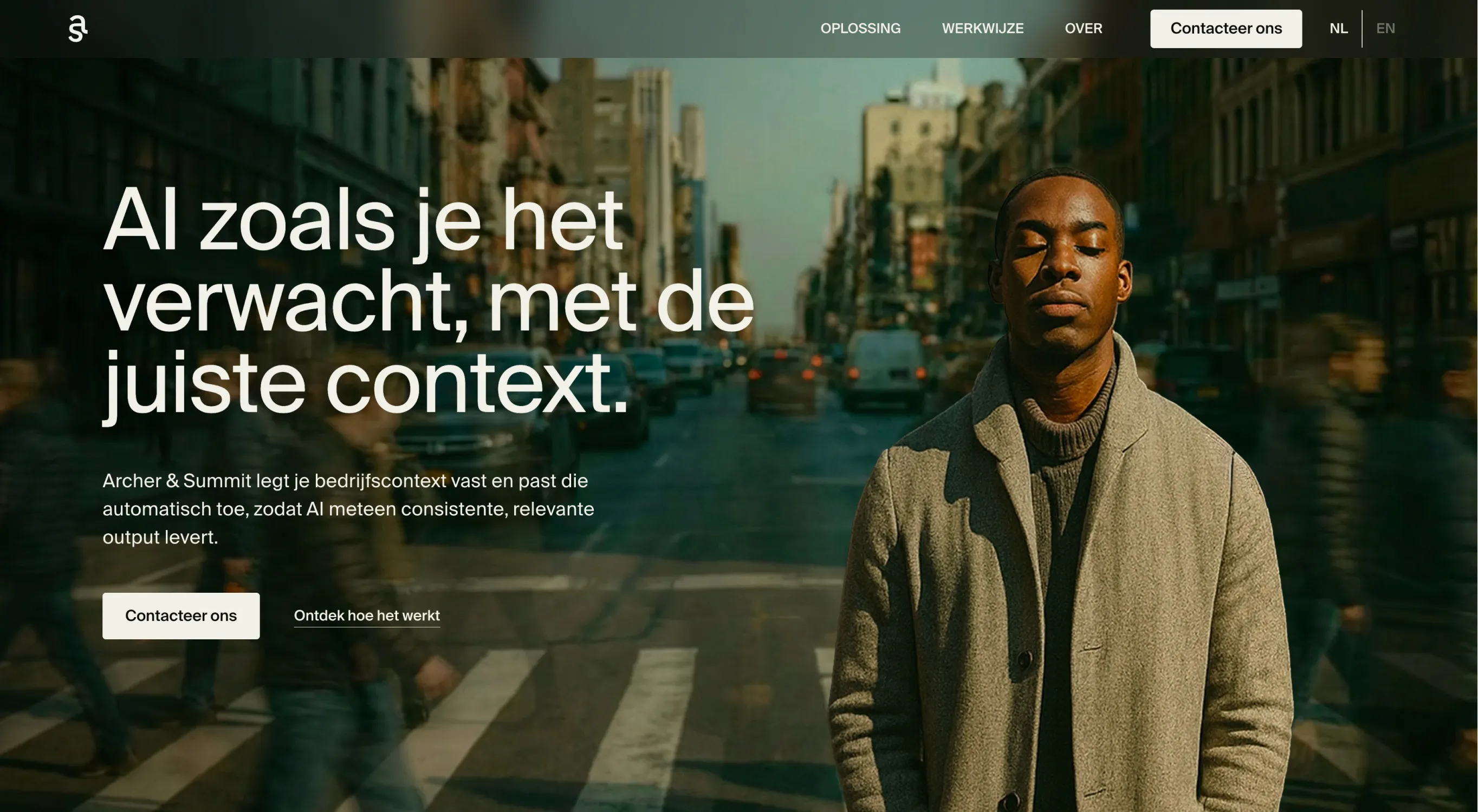
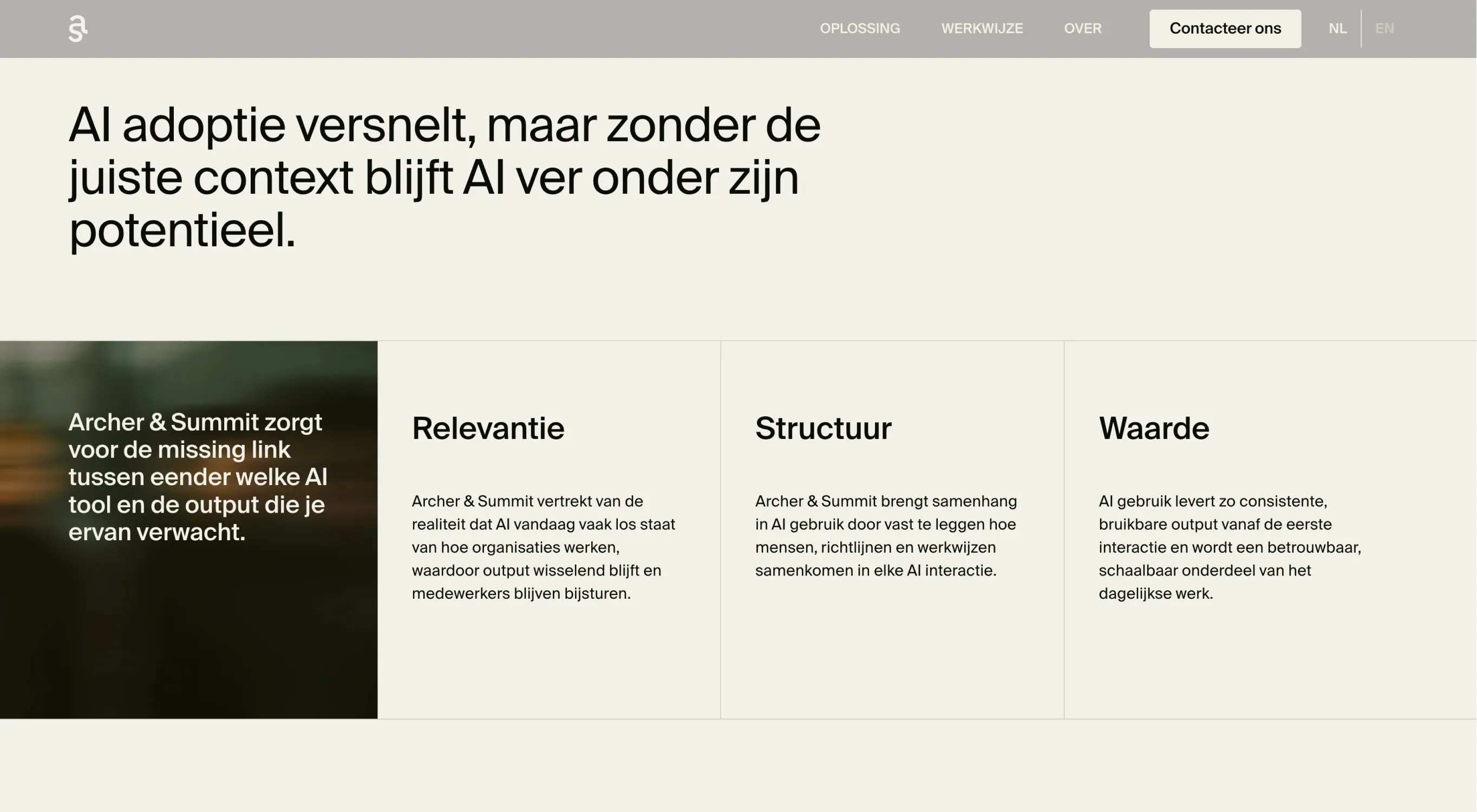
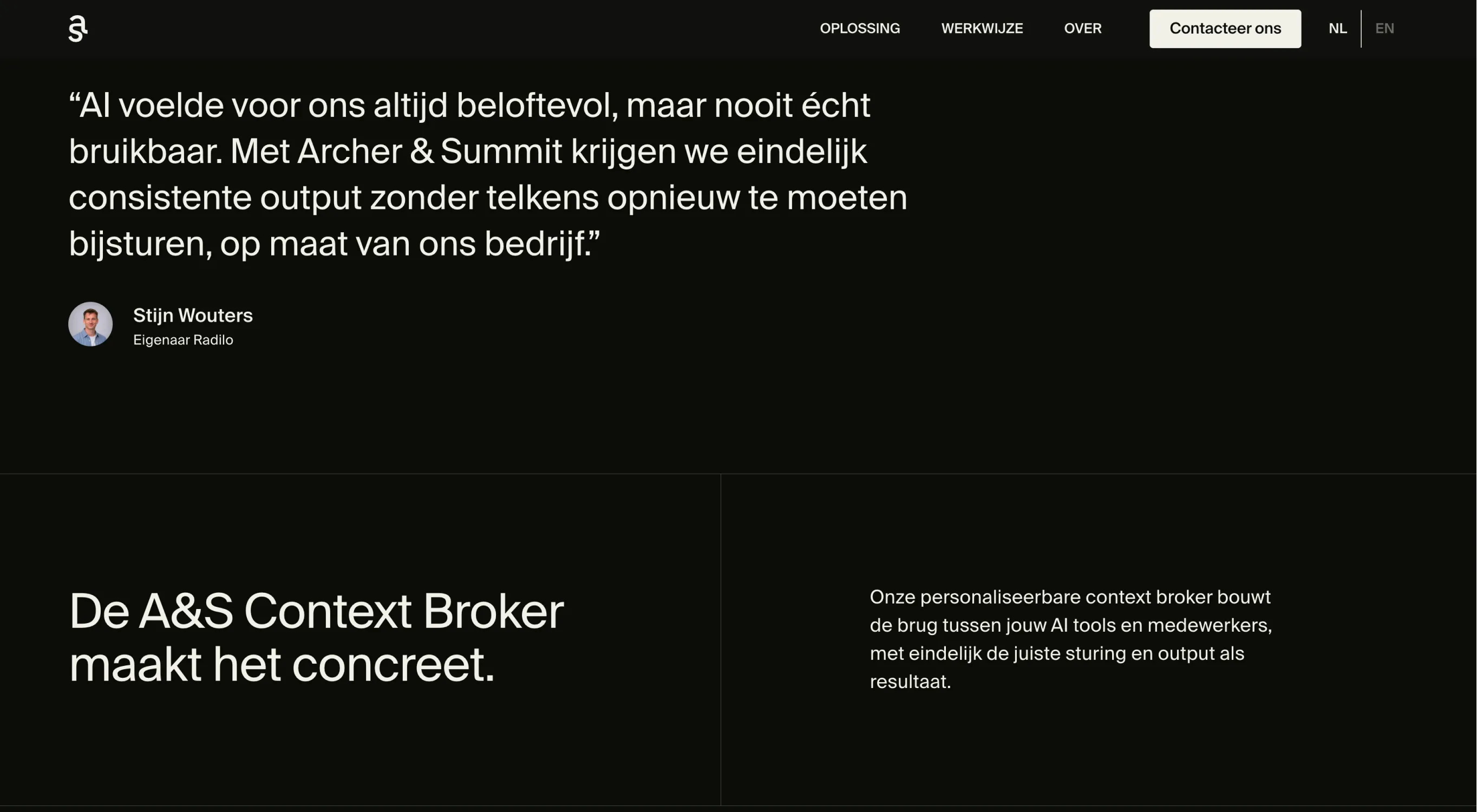
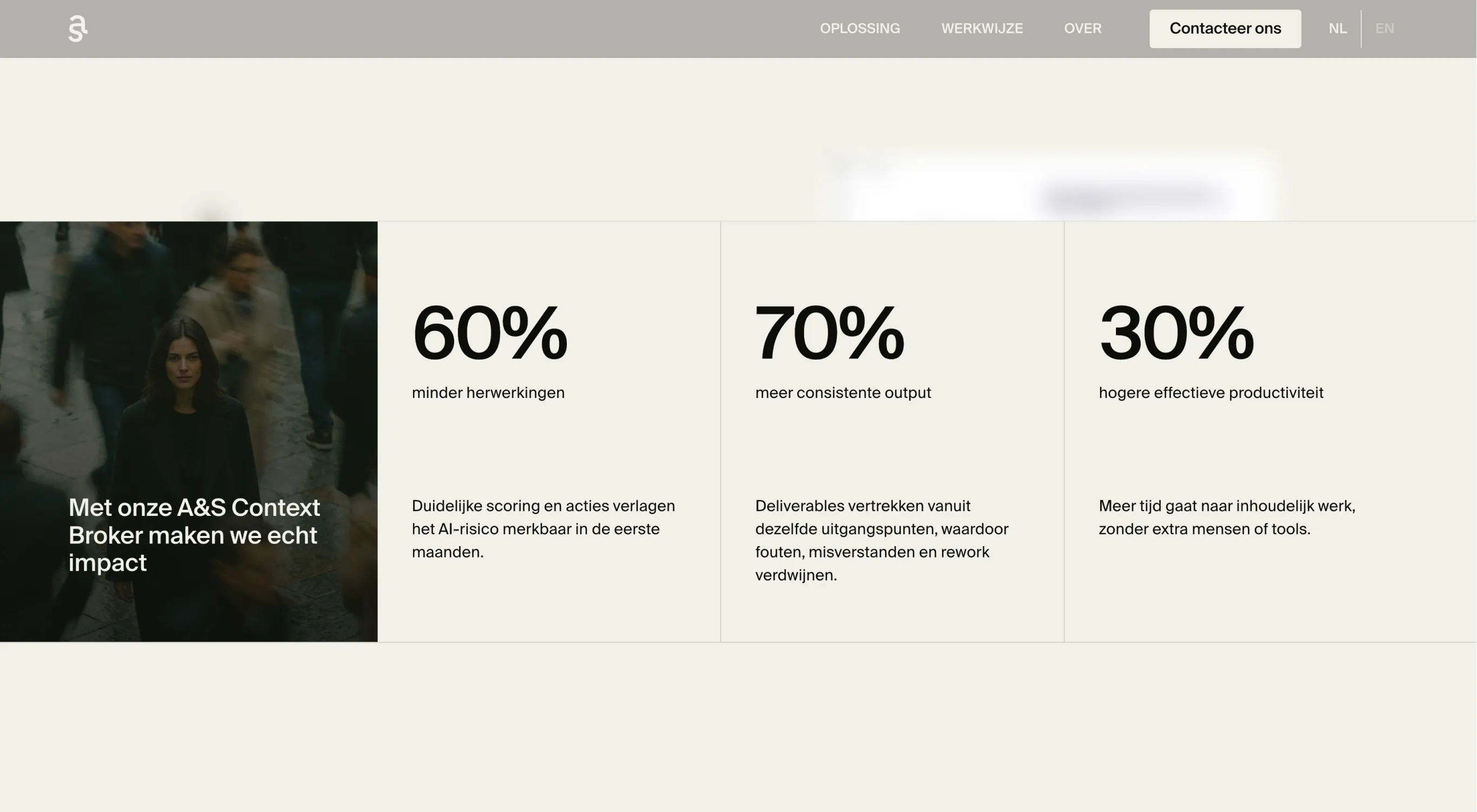
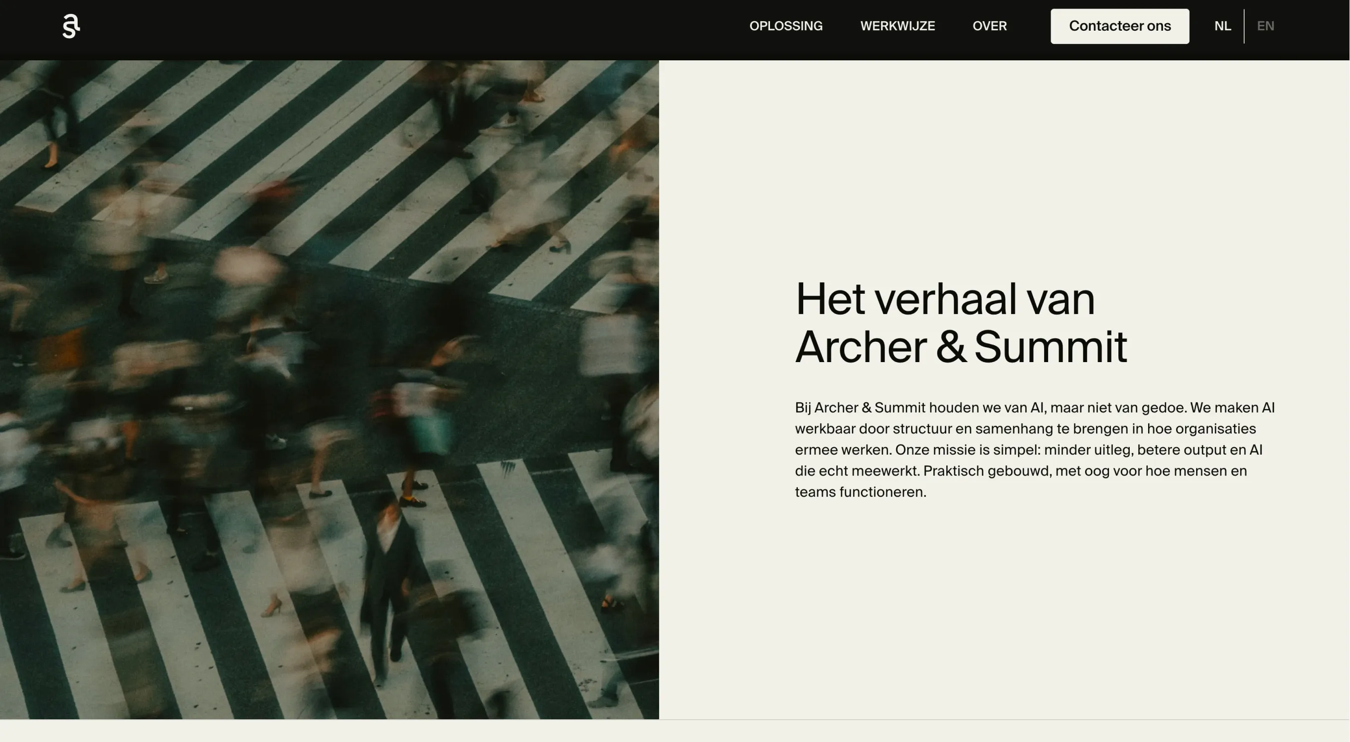
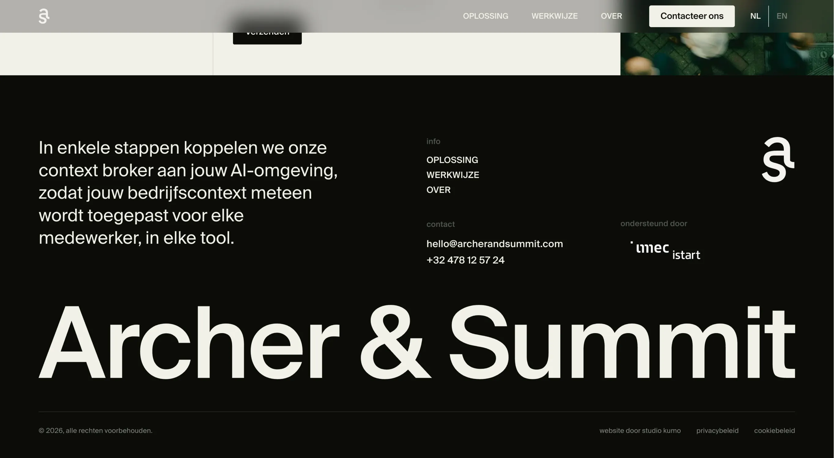
The visual language is clear and precise. A sober palette of off-black and off-white, with two accent greens that are used sparingly. Our font. The richness lies in photography, not color. Cinematic, human, precise.


No items found.

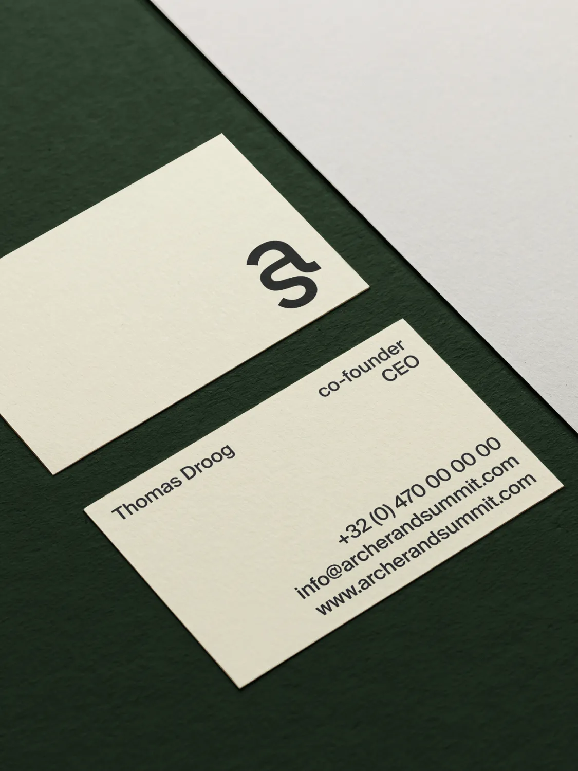
From business cards to websites, everything speaks the same language. This gives external credibility and peace of mind internally.