


No items found.
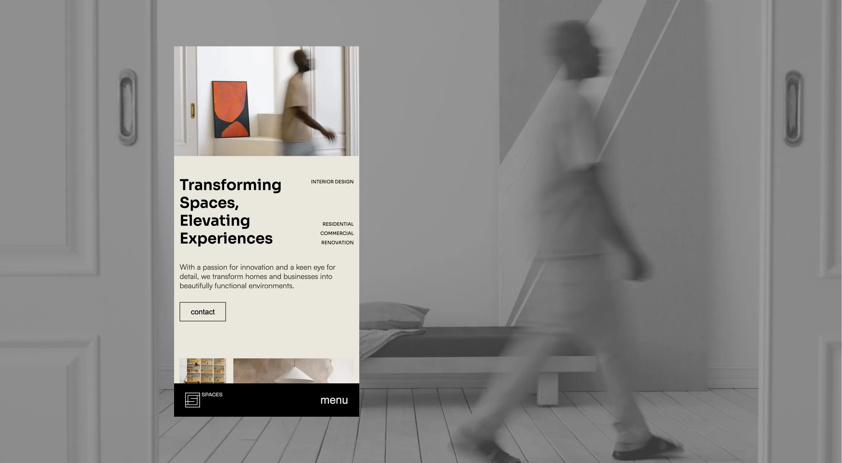
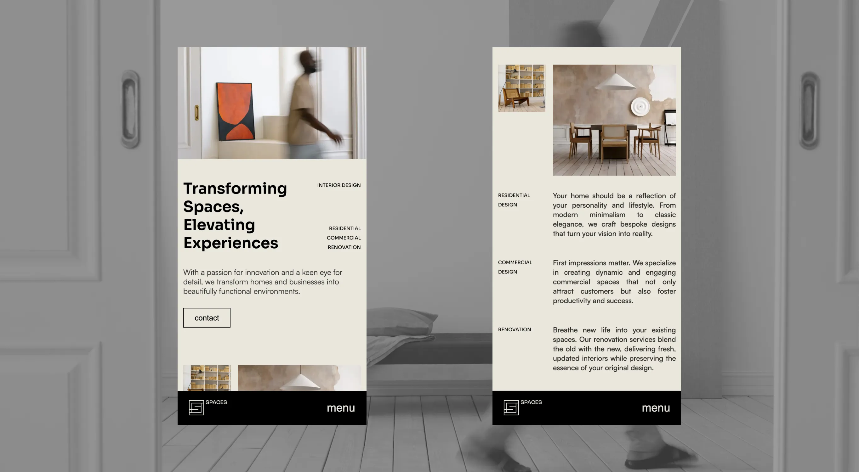
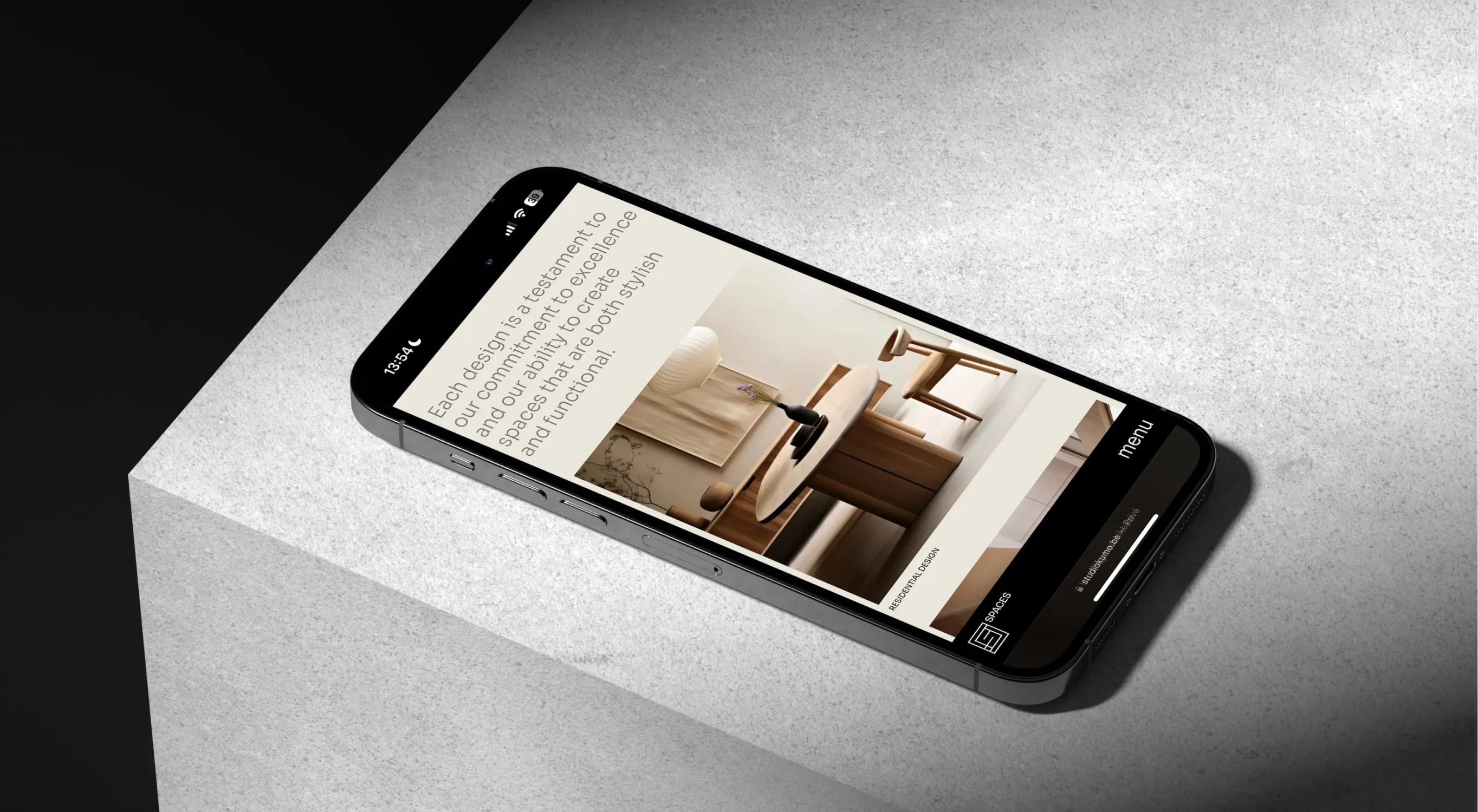
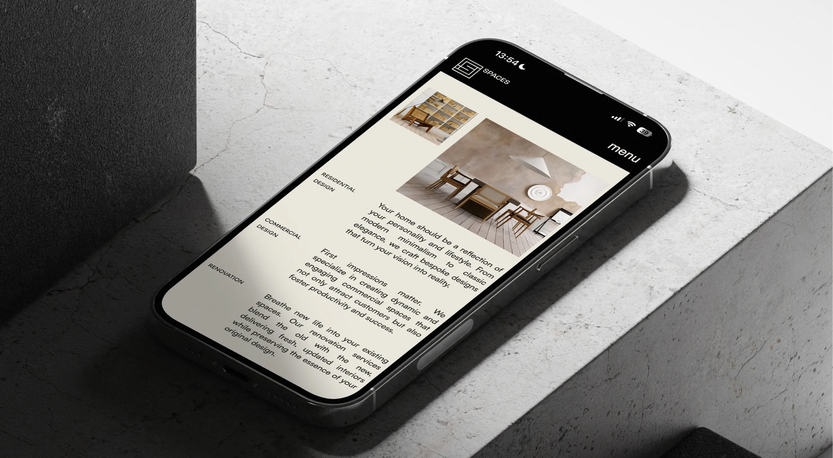
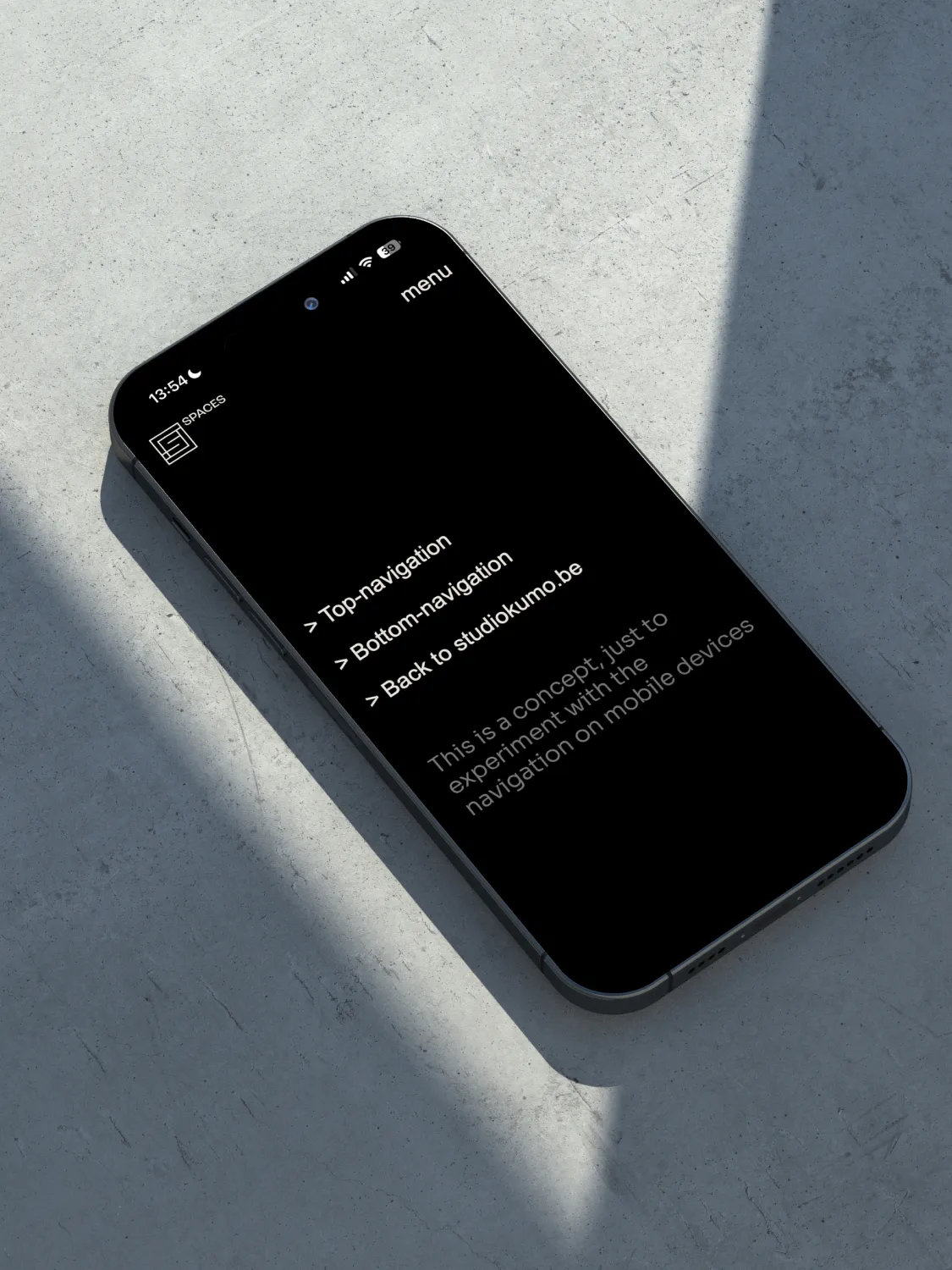
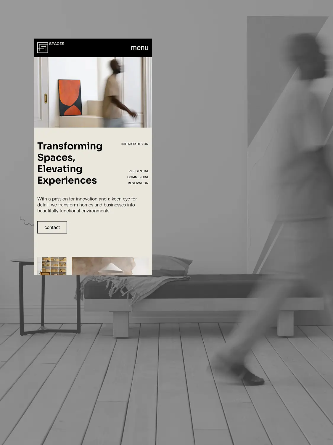
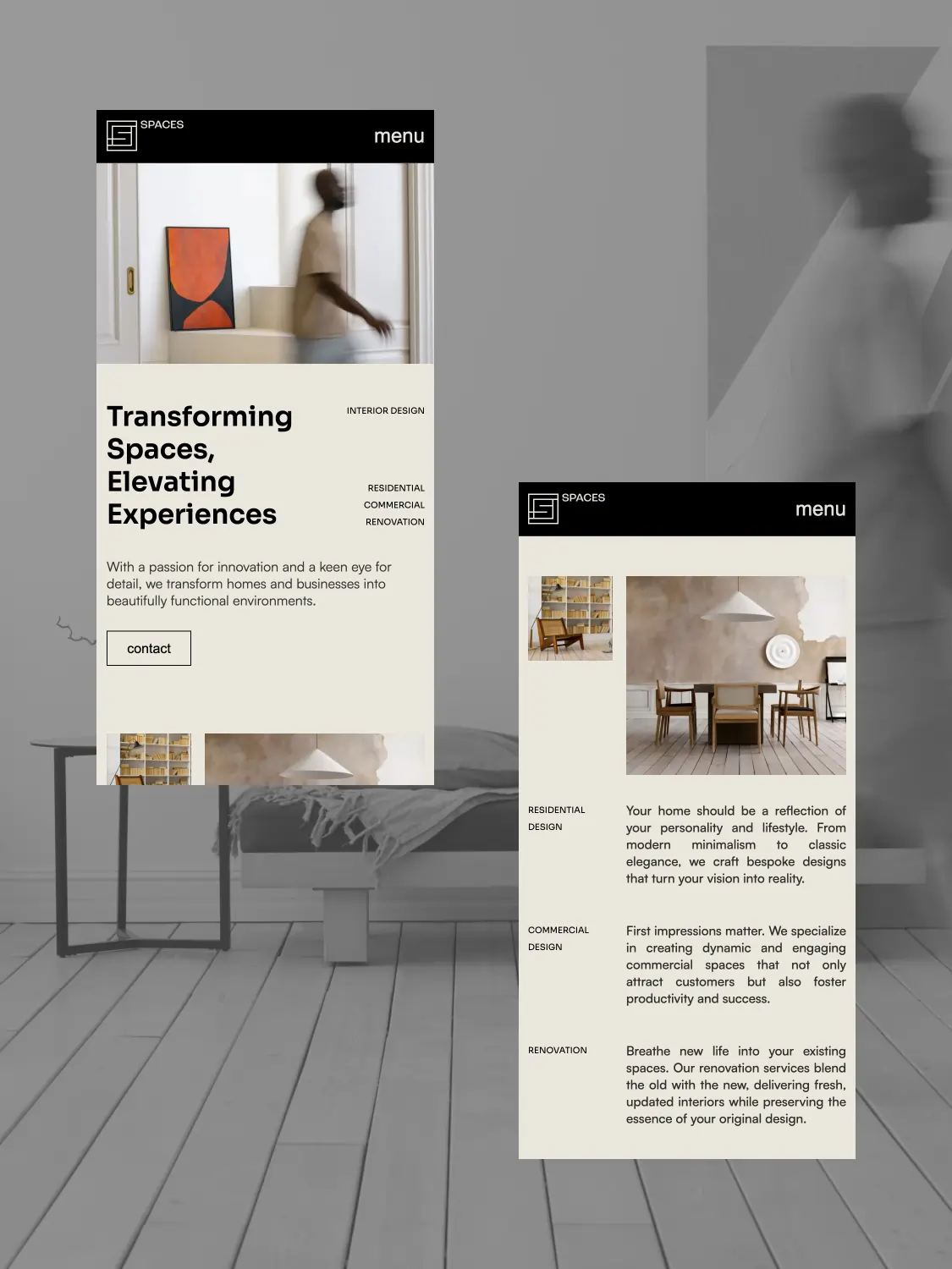
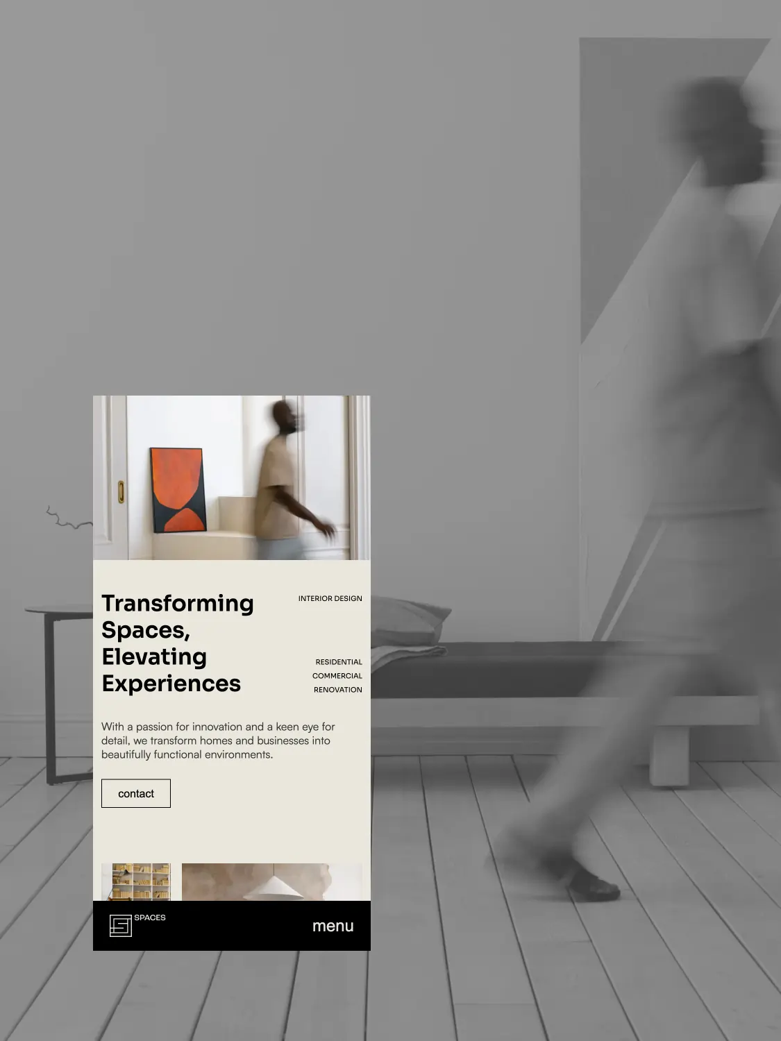
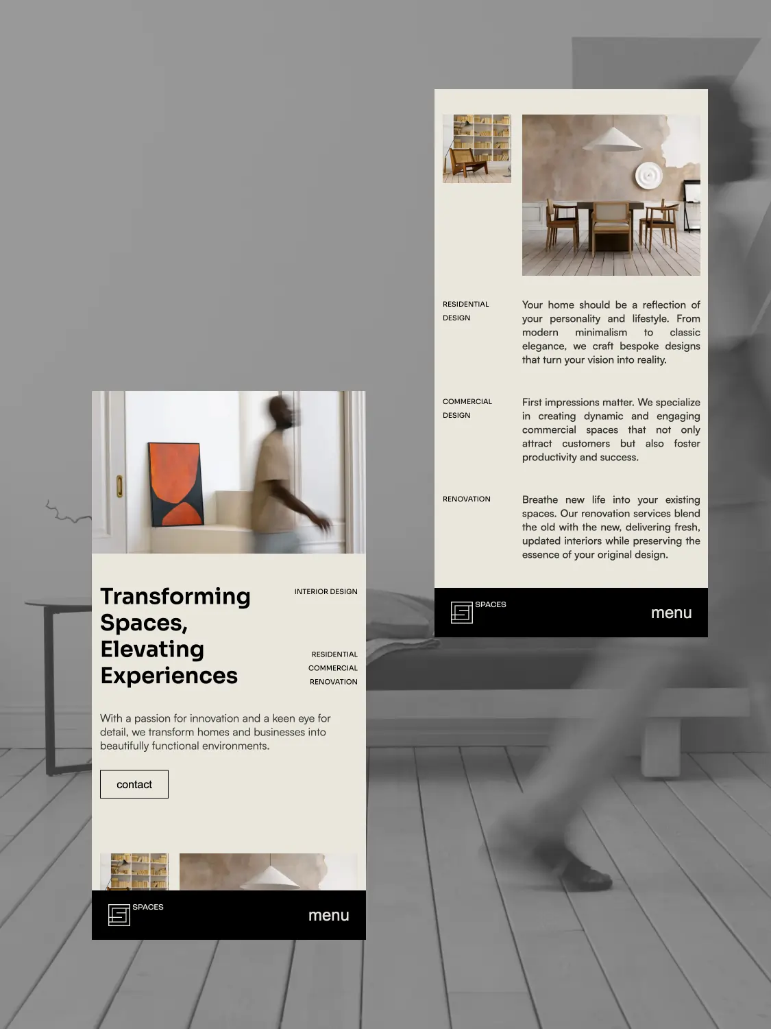
Sometimes habits clash with what actually works better. With Spaces, we wanted to investigate that. The concept starts from a simple question: is top navigation on smartphones still the best choice? We built an experimental interface where visitors can test both top and bottom navigation.
branding:
Studio Kumo
web design:
Studio Kumo
web development:
Studio Kumo
No items found.
The reactions were clear: although bottom navigation is ergonomically more interesting, the majority still prefer the familiarity of top navigation. Many people find navigation at the bottom less visible, confusing, or even annoying.
Spaces is not a solution, but an invitation to reflect. About how we build, design and use. A small shift in placement, with a major impact on feelings and behavior.