

No items found.
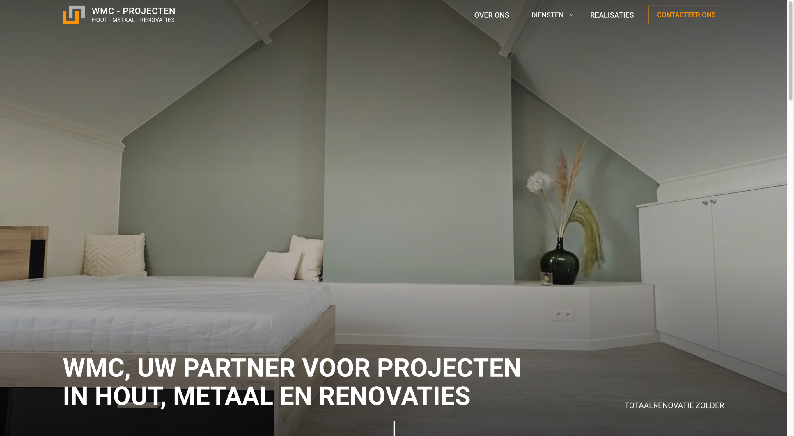
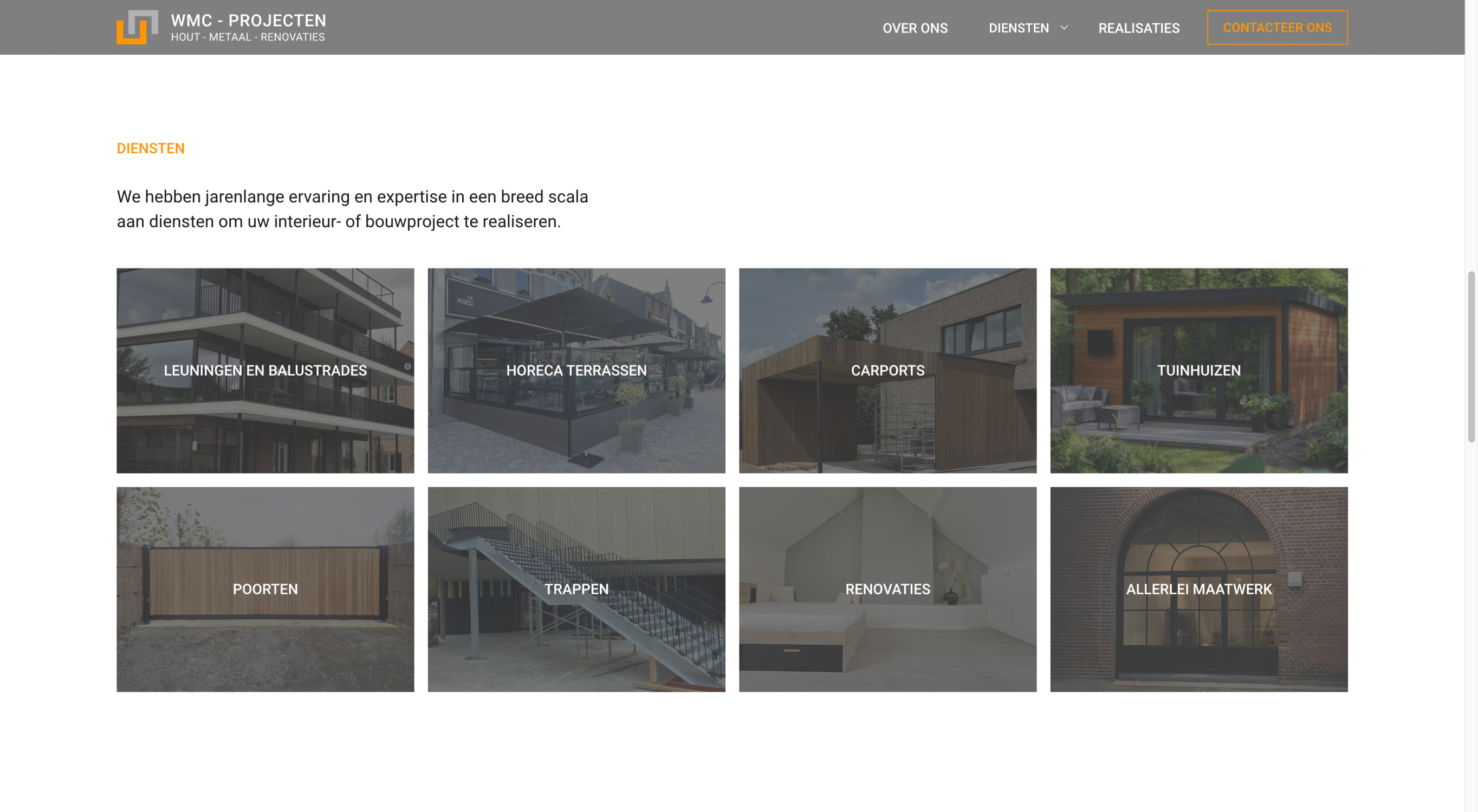
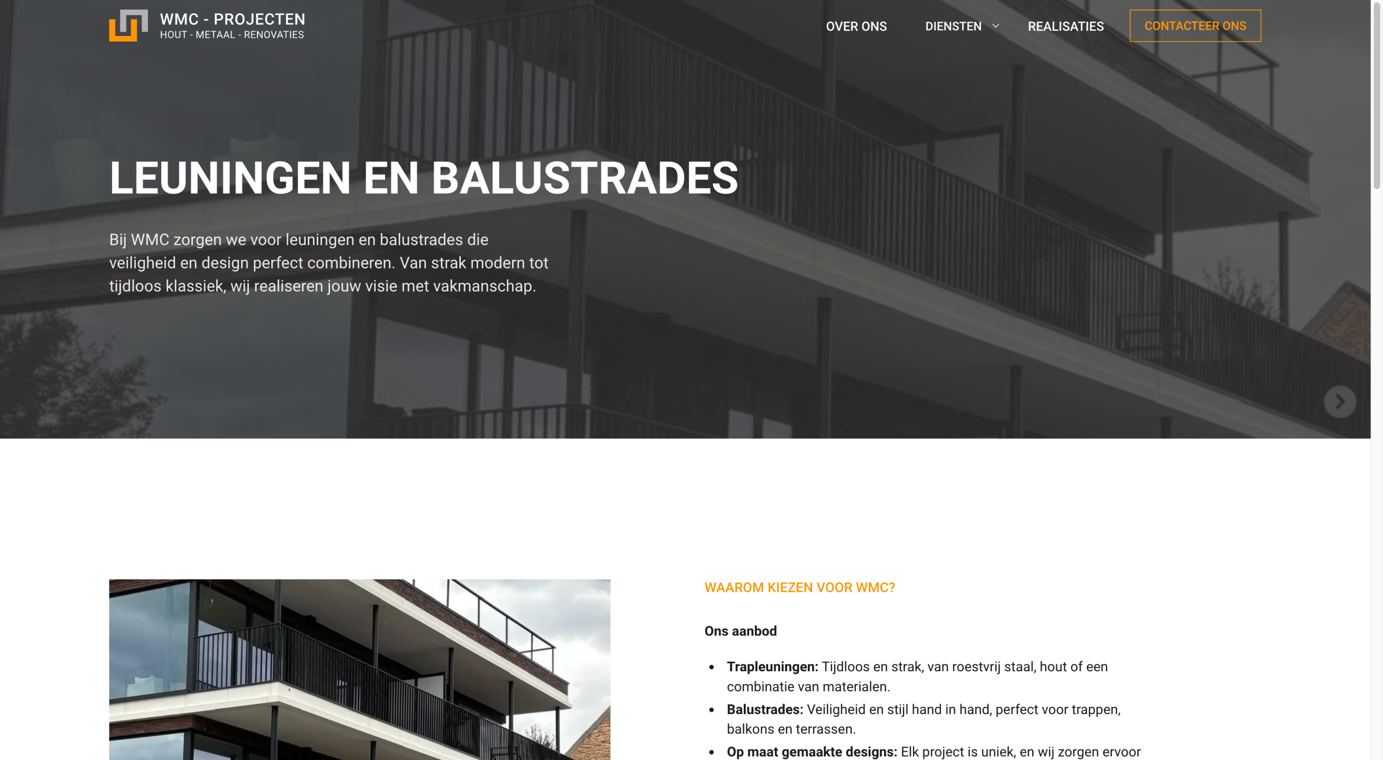
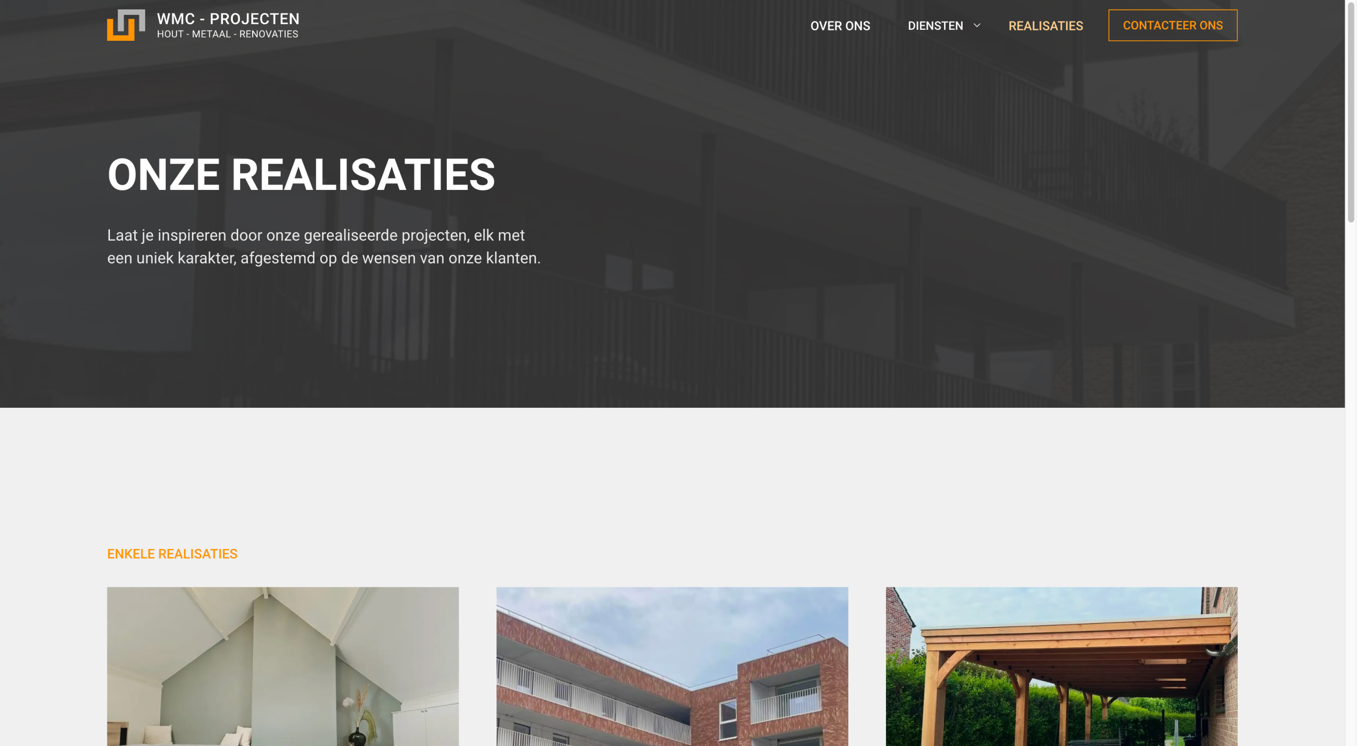
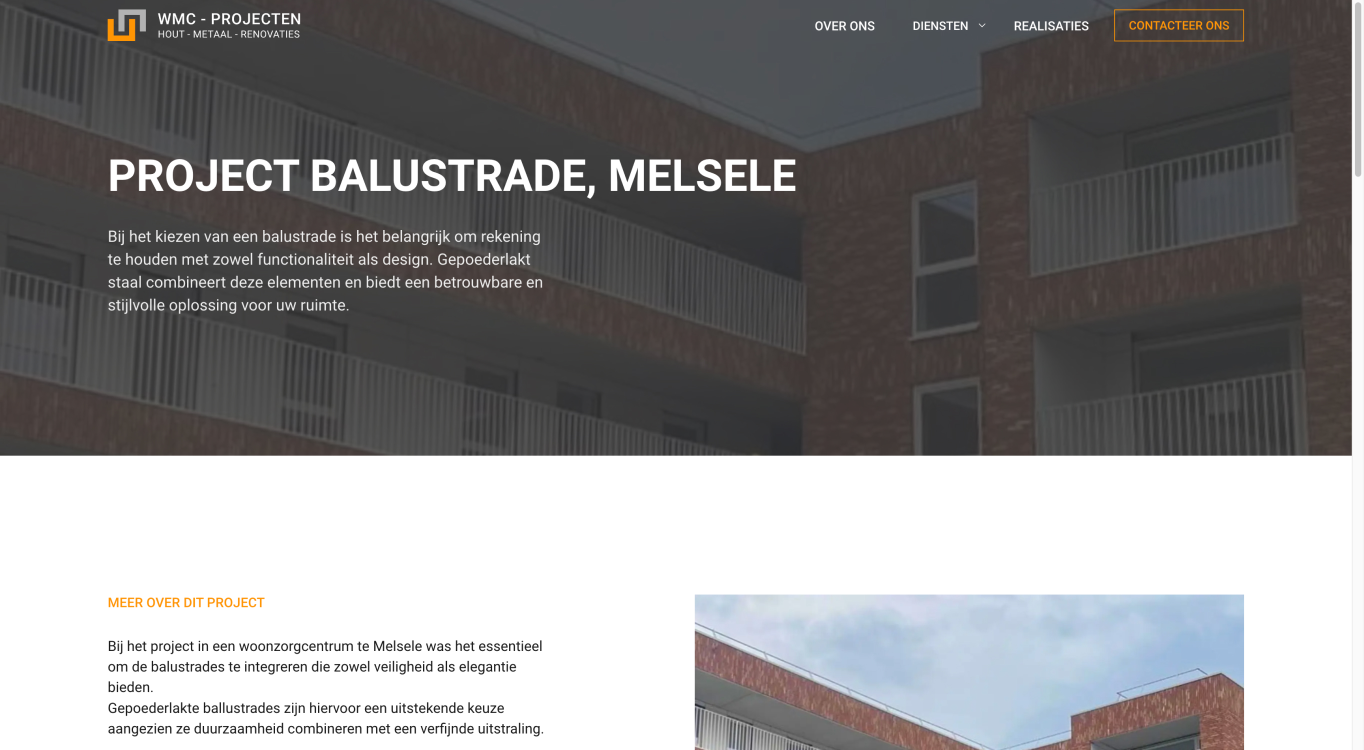
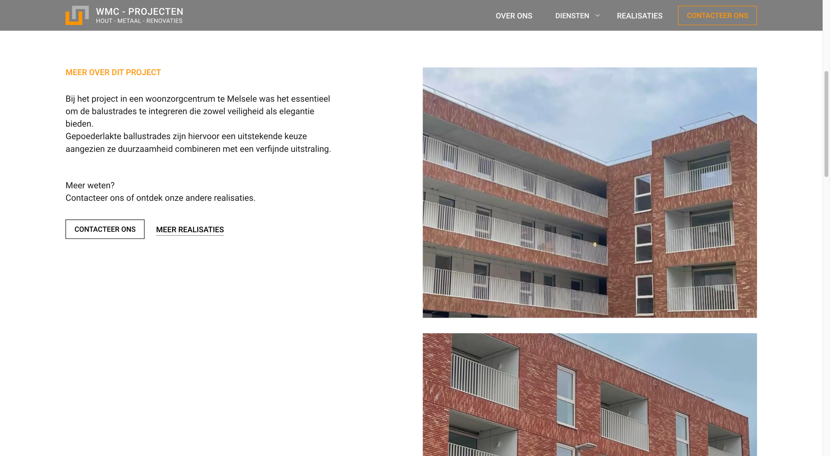
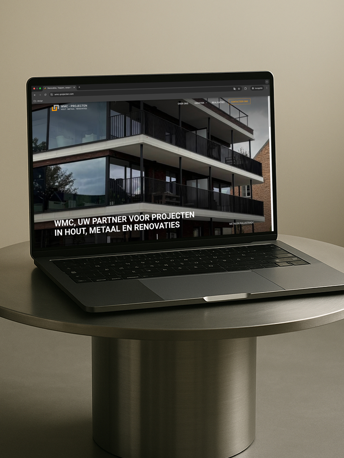
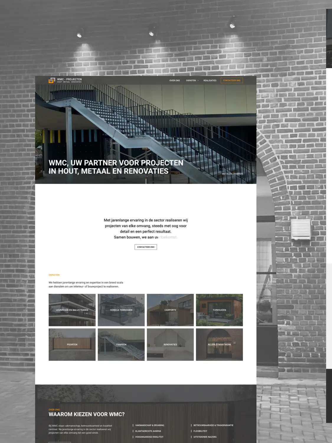
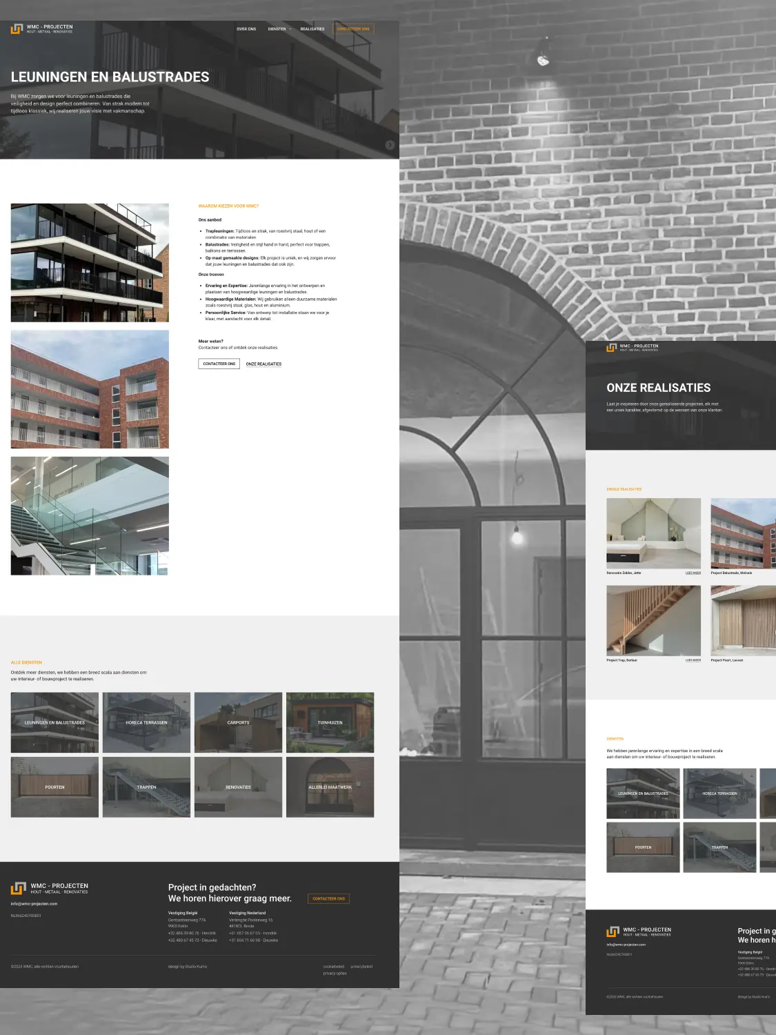
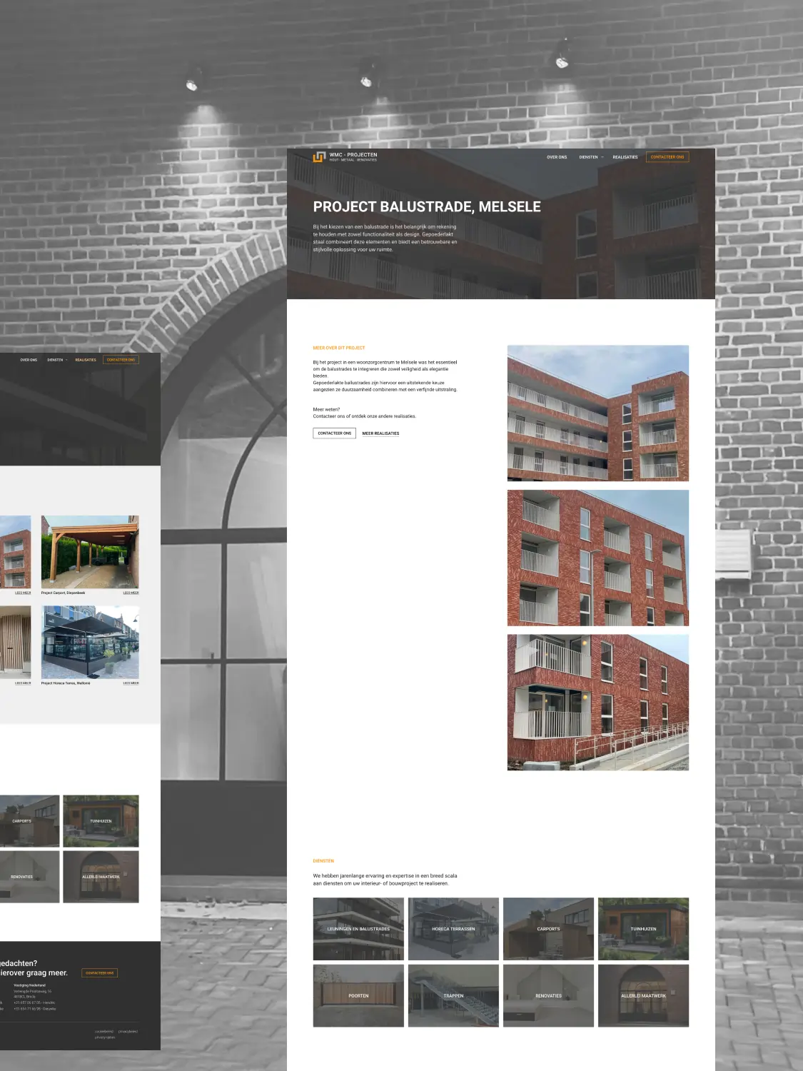
Sometimes the content is already there, but it lacks coherence. At WMC, there was a clear demand: a modern look without abandoning the existing color palette. A visual identity that exudes trust, and a website that clearly summarizes their broad expertise. Studio Kumo developed a branding that brings peace and structure. A logo with technical precision, typography that sets the right tone, and a refined color balance that takes the existing palette to the next level. The website was built in Webflow and was given a clear layout.
branding:
Studio Kumo
web design:
Studio Kumo
web development:
Studio Kumo
No items found.
The result is a consistent, thoughtful look. Quiet, but focused. Exactly what WMC needed to bring out their achievements in the right way.